Thursday, August 23, 2012

This is why we bought our lot..

Beautiful sunsets over the lake

The lower roof covers the entire width of the house, and is one of the things we're looking forward to the most.  

Progress photos - Milgard windows

Like I had mentioned in a previous post, the windows are in!  We decided to go with Milgard vinyl windows, because of the reputation that Milgard carries.  While I love the classic feel of wood windows, it just wasn't worth it to me to deal with the maintenance and cost of wood.  I think the windows look great, especially the grid pattern.  I also love the oval window, which is something I really wanted to add a bit of visual interest and a coastal feel.  We'll have a circular window above the reading nook in our master bedroom and the oval window will be in the transitional space between the master bedroom and master bath.

Windows above the bench seat in the office

Oval window in the transitional space between the master bedroom and master bath 

Progress update - plumbing, HVAC and electrical

Progress continues at our house, with the plumbing, HVAC and electrical crews working hard to get things finished before the walls close. 

I'd like to take a moment to mention my Dad.  He just recently "retired" and has been helping us manage the plumbing, HVAC and electrical work.  My Dad has built several homes in the past and knows the ins and outs of this part of the process, whereas to me, it's a completely foreign language (more on that later).  He's been an incredible resource in making sure that everything is running smoothly and we won't have any regrets once the sheet rock goes up. 

This part of the process started off with a bit of confusion, as the plumber was first in.  Apparently the HVAC guys should've been first in line, but since there was a bit of a scheduling mix-up wit the HVAC company, the plumber lucked out and was able to get started before anyone else.  This led to a bit of a space war when the HVAC crew showed up.

Here's the recap:

Plumbing

The plumber was first in, which gave us plenty of time to get to know him and go through all of the plumbing details in the house.  We worked through the interior, going through the placement of each fixture throughout the kitchens and bathrooms.  Then we made our way outside where we added a hot/cold fixture towards the front of the house for washing dirty cars and mountain bikes.  We also put in an extra large hot water tank and a circulating pump to ensure that we always have hot water.  I've been nothing but impressed with the plumber.  He's a good guy, knowledgeable, reliable, always on time and has a sense of humor to boot!  In his words, "We're using 3 inch pipes and that diameter should be just fine, because if you have a 3 inch turd, you have a problem."  Awesome.

HVAC

The HVAC guys were the next to show up.  This was the most difficult and stressful part of the entire building process so far, because they were Ukrainian speaking and had limited understanding of English.  We had a small issue with the vent fan in the powder room, and finding a place to put it, as the plumber had hogged a bit of joist space.  I attempted to use my Google translator while sorting through this issue and since the translator is quite literal when converting Ukrainian to English, we ended up with a discussion about "bigger hair dryers" instead.  Thankfully we were able to get everything sorted out in the powder room and moved into the issues in the kitchen.  Again, it was a space issue in the joists.  We ended up changing from a circular to a rectangular duct to properly vent the range hood (more on the range hood debacle in another post).  Our other HVAC issue was that we lost a significant amount of space in our master closet corner to allow for the chase for our air return.  This is an issue that we didn't have a lot of choice in sorting out.  My husband's suggestion is that I stop buying shoes.

Electrical

Our electrician is awesome!  The journeyman has two apprentices working with him, one who "isn't on the job anymore."  With that being said, the journeyman and the remaining apprentice are great guys.  They've done an incredible job wiring the house and doing a very detailed walk through with us to make sure that we're putting in all of the wiring that we want now and in the future (electric car hookup).  I feel as though the journeyman has treated our house as though it's his own, which has been fantastic.

Snapshot of the plumbing, duct work and electrical in the great room

Wiring in the garage


Monday, August 20, 2012

Design inspiration - master bathroom flooring

You might remember that I was stressing about how to pull together the master bathroom.  We had met with our designer and picked a natural stone for our counter and tub deck, subway tiles for the enclosed shower, and even paint for the walls.  But the one thing that remained was the bathroom floor. 

I literally stood in the design studio and rambled like an idiot started to throw out ideas to our designer about how I wanted the space to feel: clean, crisp, cool, beachy, not too formal, relaxing, easy to clean, hides dirt.  We went through almost every option of flooring when the lightbulb came on (this rarely happens these days, since I feel slightly overloaded with this whole house building thing): what about a tile floor that looks like wood...!?  Credit for this idea is totally due to my husband, because he had mentioned it a long time ago.  I'm just amazed that I was able to articulate the idea, lost way back in the rusty filing cabinet of my brain. 

Here's the pièce de résistance!  Try not to fall in love:
sTile "Tabula Moka" porcelain tile
Master bathroom palette: porcelain tile flooring, white painted cabinets, 3cm Carrara marble slab vanity top and Benjamin Moore 1551 "La Paloma Gray" on the walls.

I love that the sTile Tabula Moka porcelain tile is all of the things that I described to our designer: clean, crisp, cool, beachy, not too formal, relaxing, easy to clean, hides dirt.  Since it's porcelain, I'll be able to Swiffer it, wipe it down with a wet wipe and it's extremely difficult to scratch.

From GetStile.com: "Tabula is wood for today's world.  A contemporary look that won't scratch, dent, swell or discolor.  A designer look that doesn't mind dogs, kids, water and life.  Tabula can be used for most commercial and residential floors.  It can also be used for shower walls and tub decks.  It fits right in with Northwest contemporary, traditional, rustic and urban loft styles and blends easily with an equally wide range of finishes.  Tabula is available in 5 colors.  It comes in 6x36 rectified planks and 3x18 surface bullnose.  It is colored-body porcelain and exceeds the ADA recommendation for slip resistance both wet and dry.  It is truly a floor like no other."

According to BaneClene.com: Porcelain tile is more scratch resistant than ceramic tile. Also, porcelain tile is fired at higher temperatures than ceramic, resulting in superior durability and stain resistance.

Progress photos - basement framing

I finally took some pictures of the basement!  Obviously the lighting isn't the greatest, but you'll get the general idea of the space. 

Originally we had planned to dig out the entire footprint of our home, putting in a full basement, with half fully finished during construction and the remaining half to be finished later.  Basements are a rarity in the Pacific Northwest, and our builder never really did understand why we wanted one.  I guess that's what happens when you have two clients from Chicago/Cleveland respectively.  In our minds: why wouldn't you have a basement?  Especially when starting a house from scratch.

You might remember the photos of the excavation crew digging:

The guy in the orange shirt is standing in our basement
That big step in the picture is the crawlspace, which sits on the backside of the house.  Originally we had planned to dig the step out, creating a full basement, but we ran into two issues:
  1. According to the people who make me want to take a nap friendly employees at city hall, the total square footage of our house, with basement, had exceeded 5,000 square feet.  You might be sitting there thinking "Seriously?  The house doesn't look that big."  Apparently the new calculations for total square footage include all covered outdoor living spaces, basement and garage.  Since we have a large size covered front porch and an even bigger covered back porch, we ended up shooting ourselves in the foot.  (It would've been really nice if the architect had been up to date on the new square footage rules, because we could've saved a wad of cash since this little rule forced us to do an architectural redraw of the basement).  The total square footage of our home became an issue, because any home in our city over 5,000 square feet requires installation of fire sprinklers.  Sprinkling a "5,000 square foot home" will set you back about $4,700 and there's always the potential for accidental flooding.  No thanks.
  2. The second reason why we decided to decrease the size of the basement was because we had come very close to meeting our export costs after digging out just half the basement.  You might be wondering what the heck an "export cost" is.  Here's the thing: not only are you paying someone to dig out your dirt, but then you're paying the same guy to load it into a truck, drive it down the road to someone else who will then accept the dirt for another project.  Since dirt has a "fluff factor," it's hard to know whether or not the money you originally budget for excavation will end up being enough.  Obviously, in our case it wasn't. 
With that being said, we still have about 1,300 square feet of a great, usable basement.  Like I've mentioned before, we decided to stick with an open railing concept to the basement, which makes it feel less like a dungeon and more like an extension of the house.  Our plan is to have a craft table, storage room, workshop, extra shelving and storage and the housing for our mechanical.  Without further adieu, here are some pictures:
The two rooms in the "half" basement.  To the left is the storage room and to the right is the workshop.  The storage room will have a door and function as just that: storage.  The workshop has a double door sized entrance, but will be left open to the hallway.  Lots of natural lighting in this room and the window provides an egress to the window well, which is required by code. 

The workshop.  This is the place where we'll wax skis, tune bikes, put all of our tools and probably drink a few beers.  We plan to build a work bench on the right side, adjacent to the wall.  Our electrical layout has lots of plugs in this room, and a TV/computer jack.

Coat closet at the bottom of the stairs

Walking under the stairs to the mechanical room.  Lots of storage in the nook just beyond the stairs.  The mechanical room will have a door for noise and aesthetics.

Looking up into the great room from the basement stairs.  The staircase will be lit with two wall sconces. 


Sunday, August 19, 2012

Progress photos - roof

We've made lots of progress since my last update!  The roof is on.  We used the Timberline HD series from GAF.  I can't say that I know much about roofing, but this is the roof that we selected with our contractor. 

Per the GAF website, here's what we get with our roof:


 GAF Lifetime Roofing System
Image courtesy of www.GAF.com


GAF has a lot of really nice, neutral colors.  We went back and forth between using a brown or a black, and in the end, we decided to use their "charcoal" color.  Here are a few pics of what our home looks like with the roof:
Front elevation with GAF's Timberline HD "Charcoal" roof

Close up of GAF's Timberline HD "Charcoal" roof - lots of nice color variation in each panel


Monday, August 6, 2012

Design Inspiration - laundry room

One of the things that I loved the most about our old house was having the laundry room upstairs.  The convenience of not lugging baskets of laundry up and down the stairs was one of the priority items on our list when we designed our home.

Our laundry room ended up being large enough to serve as a laundry and sewing room.  We'll have built in cabinets, a utility sink, washer, dryer and a sewing counter with a built in nook for my antique school house chair.  It's shaping up to be the perfect spot for sewing, especially with the east facing windows.

I've always wanted to include antique crystal knobs somewhere in our house, and this seems to be the most logical spot.  I also picked out a light fixture that's fun, adds some character and produces a lot of beautiful light in a small space.

Here's what I've come up with so far:
Wilsonart Laminate Countertop in "White Carrara" 4924  - a beautiful, cost effective option for high traffic, functional spaces.

White Shaker style cabinets

Antique reproduction glass knobs to add some fun to an otherwise utilitarian space
Glass mini pendant - approximate retail $90

Mannington Naturals "Alloy" 17382 vinyl flooring - another cost effective option that comes in large sheets to prevent seams and potential for water damage


Design Inspiration - front porch

One of the things we're most looking forward to is maximizing the potential for outdoor living.  While Seattle is certainly known for rain, we also have days that are crisp, cool and perfect for sitting on the front porch with a cup of coffee.

Our front porch is entirely covered and I plan to use this space as a place for sitting and container gardening. One of the things I love the most about the Midwest is the American flag that dots the porches of tree lined neighborhoods.  In coming up with a color palette for the front porch, I wanted to use red as the main accent color.  Red is certainly a departure from the colors that I've used in the past, and I'm really looking forward to stepping out of my comfort zone and creating a space that's colorful, comfortable and inviting.

Benjamin Moore HC-165 "Boothbay Gray" -  our exterior house color
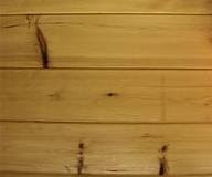
Pine tongue and groove porch ceiling
Red Adirondack chairs - I got 2 on sale at World Market, with the coordinating table in Espresso
Red geraniums to add a pop of color

Love the petunias with the American Flag in the background.  Our porch will have similar square columns, painted white.
Jeldwen front door - fell in love with this picture, which I pulled out of a magazine